Standardised SwiftUI Previews
Accessibility in plain sight.
Haste and Perfectionism
SwiftUI Previews enable a very tight feedback loop on modifications to UI code.
Make the font bigger. Looks good.
Make it bold. Looks better.
Add symmetrical padding. So spacious.
Give it some flair with a background image. Wow.
Round those edges. Much safer.
Bring it into the foreground with a drop shadow. Done.
☝️ Re-inventing a card view like this is achievable in 15 seconds of cathartic, instant-gratification programming...
But how often do we check dark mode?
What about Dynamic Type with larger fonts?
Or smaller fonts?
We obsess over pixel-perfection, but our view is narrow. We typically only observe the small details we're concerned with at the time - a hardware limitation of our meaty vessels, but also an optimisation. After all, not all code changes are influenced by colour scheme or font size preferences. Those that are deserve more attention, but it's not unusual to find ourselves carried to each consecutive quick win by wave after wave of "todo list done" dopamine.
The Big Picture
Preferences such as colour scheme and base font-size, among many others, are customisable on Apple's mobile platforms. One may reasonably expect many users to accept a default configuration, but a significant number will not (or can not).
It is eye-opening and highly worthwhile to get some perspective on how some users interact with technology.
As more accessibility features surface to the onboarding steps of device setup, the number of variations out in the wild will inevitably increase. Users who, today, aren't aware that their iPhone can display text just that little bit bigger may eventually find themselves calibrating the minutiae of their experience.
With accessibility being a core principle of Apple's design ethos, App Reviewers would be justified in rejecting apps which fail to meet inclusive standards.
It is no longer sensible for software creators to ignore this.
The Pit of Success
Developers can set themselves up for success when building SwiftUI views with a little upfront investment.
Previews are just code, which means they can take advantage of programming best practices concerning reuse and composability.
Imagining the utopia is an ideal starting point: a reusable, minimal, succinct way to declare Previews so that we can observe a number of preset configurations simultaneously. We want to achieve something like the below...
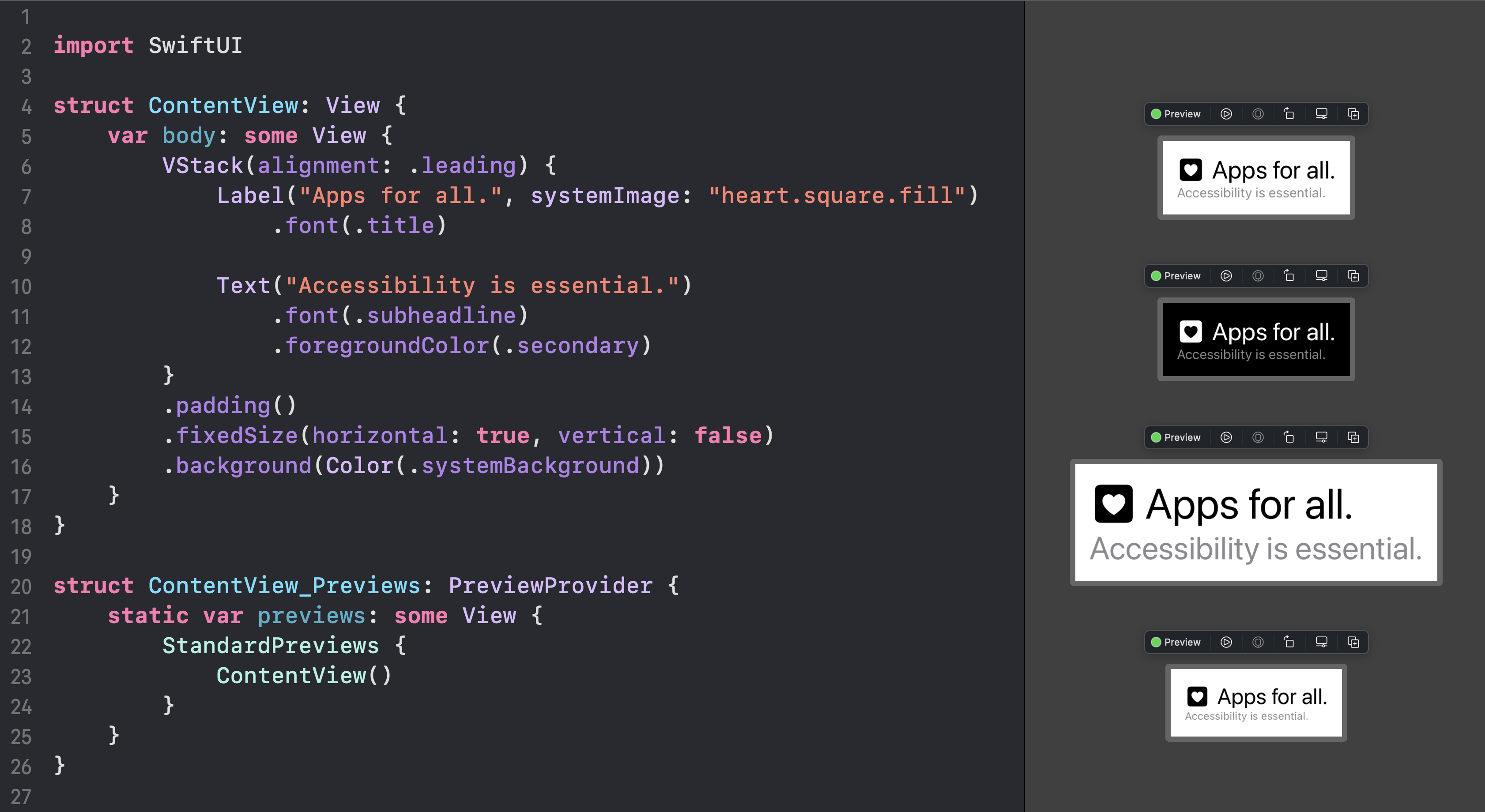
With the API defined, it turns out the implementation is trivial.
import SwiftUI

struct StandardPreviews<Content: View> : View {

    var content: () -> Content

    var body: some View {

        Group {

            content()
                .environment(\.colorScheme, .light)

            content()
                .environment(\.colorScheme, .dark)

            content()
                .environment(\.sizeCategory, .accessibilityExtraLarge)

            content()
                .environment(\.sizeCategory, .extraSmall)

            // ...
        }
        .previewLayout(.sizeThatFits)
    }
}
Modify as required to include test data, mock protocol implementations, app-specific environment injections, and/or other preference configurations.
Limitations and Considerations
Running SwiftUI Previews is not without turmoil. Those unfamiliar with keyboard shortcuts will find themselves frequently cursoring around to refresh or close-and-reopen a temperamental canvas view. Rendering multiple Previews exacerbates these (very known, very pervasive) issues.
Apple Silicon seems best equipped to deal with these scenarios, with Intel-based Macs struggling to keep their cool and throttling hard under the pressure.
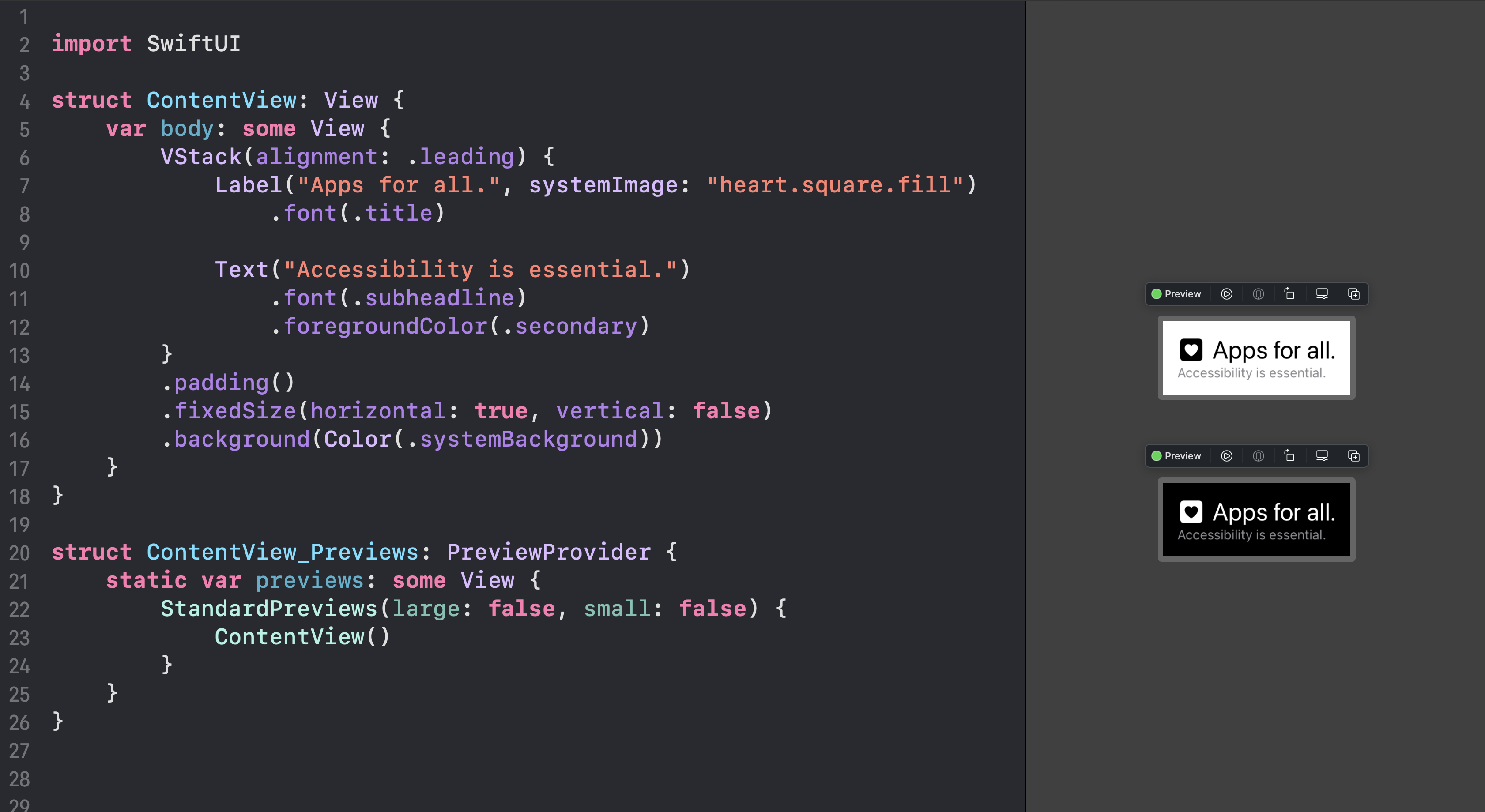
Otherwise, to maximise system well-being, it may be necessary to narrow the focus of some StandardPreviews usages. It may also simply be the case that some preferences are irrelevant to the view under construction.
We can modify the implementation to conditionally render variations with a few properties.
struct StandardPreviews<Content: View> : View {

    var light: Bool = true
    var dark: Bool = true
    var large: Bool = true
    var small: Bool = true
    // ...

    var content: () -> Content

    var body: some View {

        Group {

            if light {
                content()
                    .environment(\.colorScheme, .light)
            }

            if dark {
                content()
                    .environment(\.colorScheme, .dark)
            }

            if large {
                content()
                    .environment(\.sizeCategory, .accessibilityExtraLarge)
            }

            if small {
                content()
                    .environment(\.sizeCategory, .extraSmall)
            }

            // ...
        }
    }
}
Now we can opt out of certain variations as we see fit, whether it's to maximise meaningful screen real-estate or simply to stop the CPU from melting. The "opt out" aspect (as opposed to "opt in") is important; the need to explicitly ignore some preferences transforms the act from accidental negligence to (hopefully) justified deliberateness.
Closing
Getting oneself into good habits can be as difficult as getting out of bad ones. By standardising all our SwiftUI Previews like this, we make it more difficult to ignore accessibility concerns when we are "in-flow", squeezing pixels ever closer together, never wondering "what if the base font size is bigger?".
No need to wonder when the answer is always in plain sight, and no more excuses either.